
RYOT
INTRO:
RYOT needed a bold and fresh contemporary identity and new brand architecture to compete with other media companies like Vice, Gawker and Mashable.
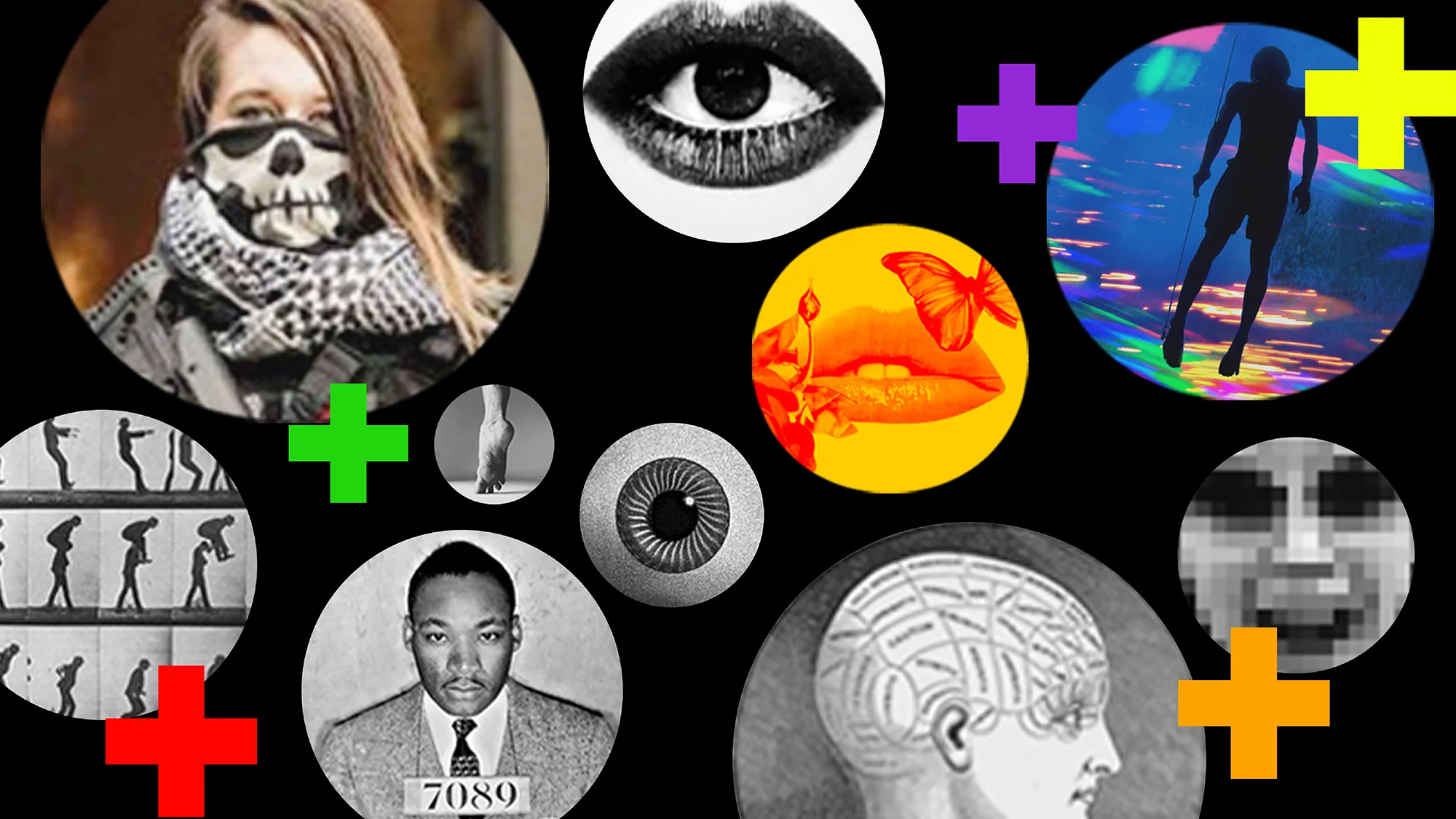
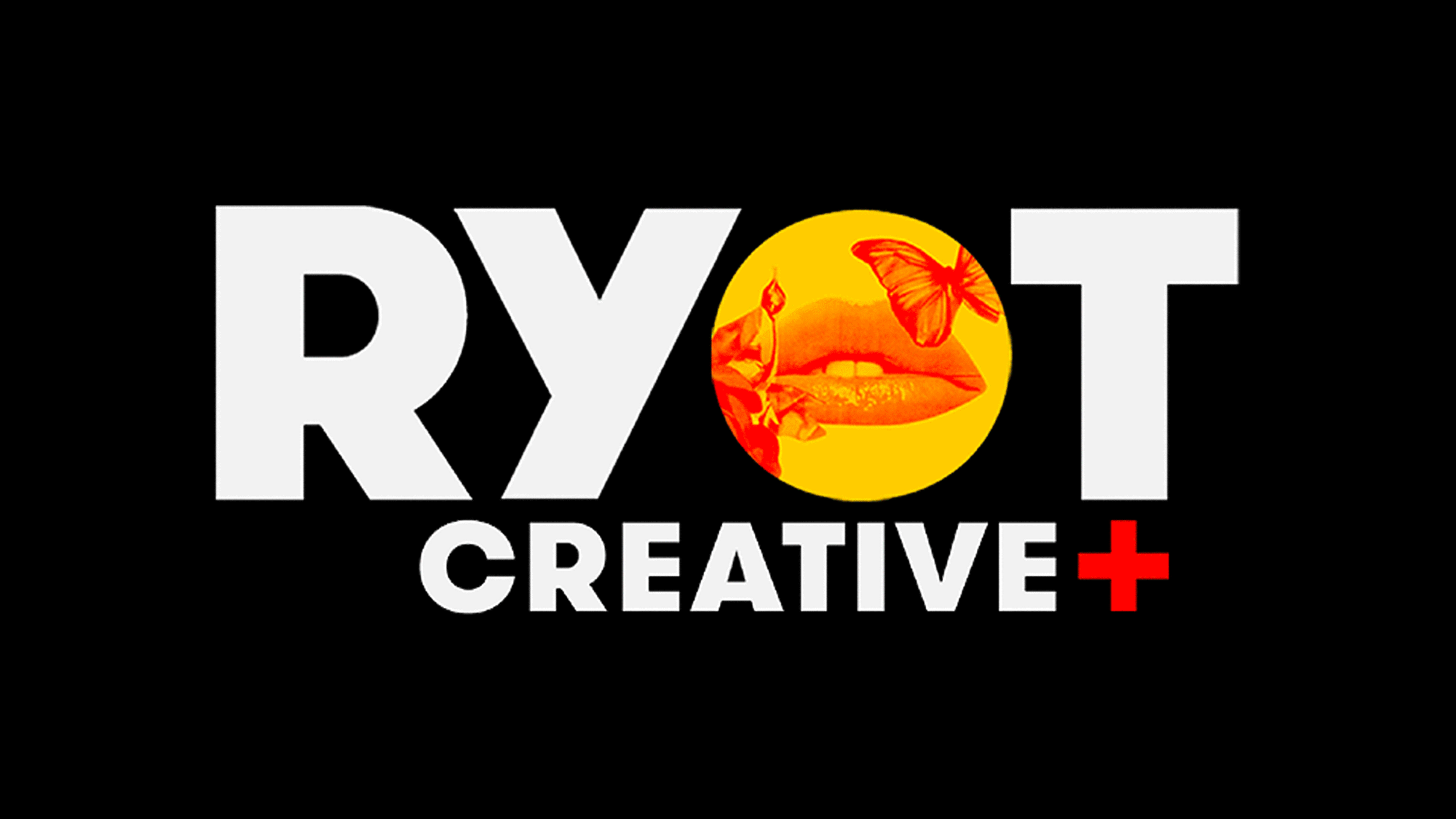
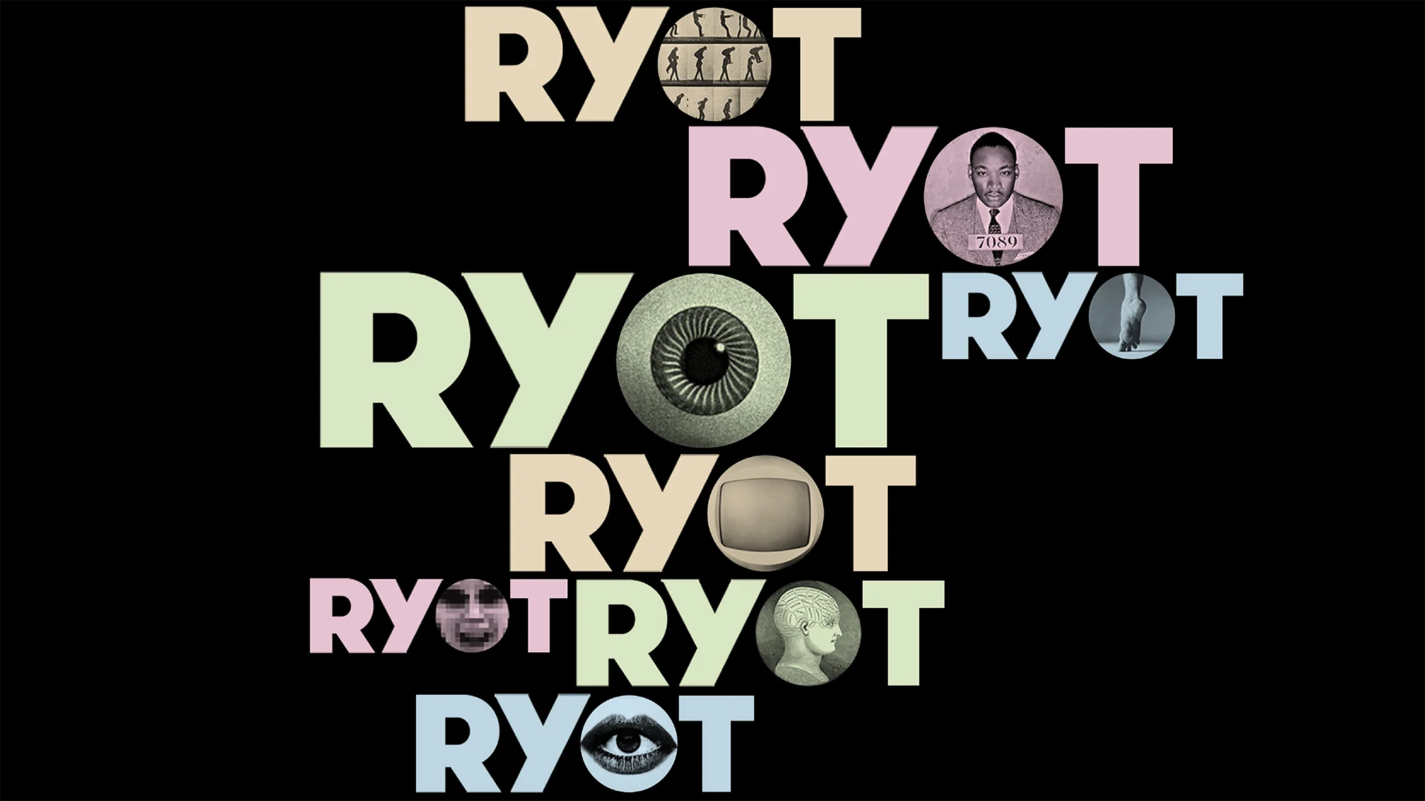
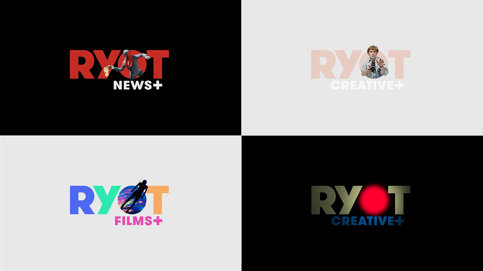
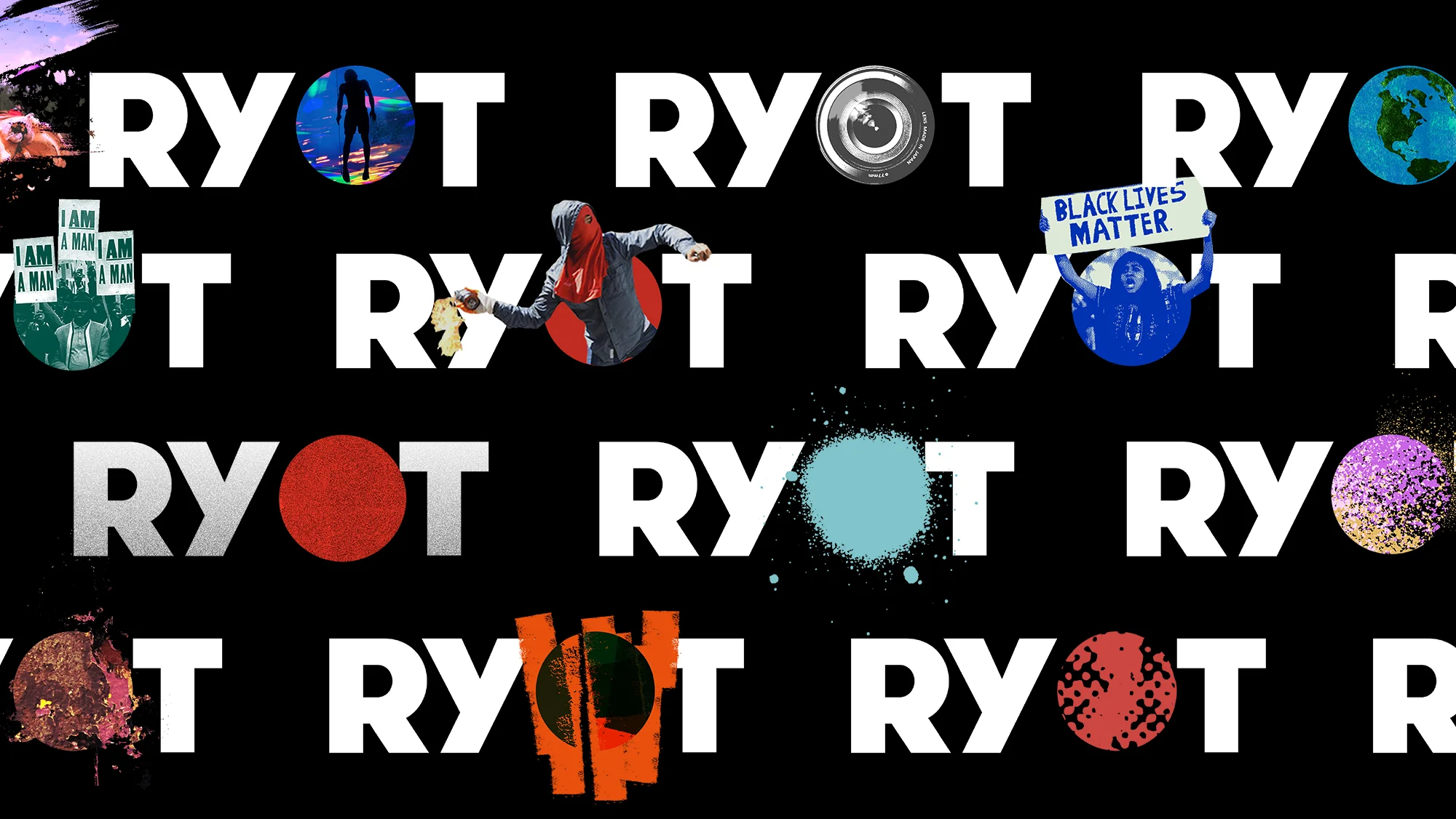
The rebrand evolved in into a new logotype with a modular system set around the letter O. This system gave flexibility to the brand to not only use limitless amounts of contextual news based imagery but also gave the brand a structure to grow new verticals seamlessly.
The rebrand project was in collaboration with Erik Buckham and Palace Works directly with RYOTs’ senior leadership


The Concept
The identity rebranding evolved into a new logotype with a modular system set around the O in RYOTs' brand name.
The new system gave flexibility to the brand to not only use limitless amounts of contextual news based imagery but also gave RYOT the structure to grow their Film, Creative, News and Foundation verticals seamlessly.
Touchpoints


Brand Guidelines


